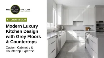
Introduction
Grey floors paired with grey countertops can read as quietly sophisticated — a palette that lets premium materials speak for themselves. Get the balance wrong, and the same combination turns clinical. A space that photographs well but feels cold to actually live in.
The grey-on-grey palette has earned its place in high-end kitchen design precisely because grey is a true neutral. Unlike beige or cream, it doesn't carry a dominant undertone that competes with natural stone veining, matte cabinetry, or brushed metallics. That restraint creates room for everything else to shine.
But restraint isn't the same as ease. Making two grey surfaces work together requires deliberate decisions: which shades to pair, what cabinet color provides contrast, how to introduce warmth, and how lighting either rescues or ruins the whole effort.
This guide works through each of those decisions in practical terms — from shade pairing and cabinet contrast to warmth and lighting — so Los Angeles homeowners can approach a grey-on-grey renovation with a clear plan rather than a mood board and a hope.
Key Takeaways
- Grey floors and grey countertops succeed when they differ in shade, texture, or tone — not when they match too closely.
- Cabinet color is the single most powerful lever for adding contrast and personality to a dual-grey kitchen.
- Warm wood, brass hardware, and 2700–3000K lighting keep a grey palette from reading cold.
- In 2026, luxury kitchens favor layered grey with natural stone and warm accents over stark monochrome.
- Undertone compatibility between grey surfaces must be evaluated in your home's actual light.
Why the Grey-on-Grey Kitchen Palette Works in Luxury Design
Grey's neutrality is what makes it so effective in high-end kitchen design. Unlike warmer neutrals — beige, cream, greige — it doesn't impose a dominant hue that competes with expensive materials. Marble veining, brushed brass hardware, and matte lacquer cabinetry all read more clearly against a grey foundation than they would against a warm-toned background.
Architectural Digest frames grey as an elevated kitchen neutral: "A white kitchen will always be a classic, but go a little darker — a soft dove gray, a moody charcoal — to take your work space from everyday to elegant." That shift from classic to elevated is exactly what the grey-on-grey palette achieves when executed with intention.
Style Versatility Across Luxury Design Categories
Grey is unusually style-agnostic, which matters for clients who want a kitchen that doesn't date itself. The same palette supports:
- Modern minimalist — where grey recedes to let architectural form take center stage
- Transitional — pairing grey with traditional cabinet profiles and warm hardware
- Industrial chic — concrete-look floors, dark charcoal counters, exposed metal accents
- Scandinavian — light grey surfaces, white oak cabinetry, clean negative space
As Benjamin Moore notes, grey ranges from cool blue-leaning tones to warm red- or yellow-leaning ones. That tonal range is what makes the selection process matter — choosing the right grey temperature determines whether your kitchen reads cool and contemporary or grounded and warm.
How to Choose Between Matching and Contrasting Grey Tones
Whether the floor and countertop greys match or contrast is what separates a grey-on-grey kitchen that feels layered and sophisticated from one that reads flat and unfinished.
When Matching Grey Tones Works
Tone-on-tone grey can succeed, but only under specific conditions:
- The two surfaces differ significantly in texture or material finish — a honed concrete-look floor paired with a polished quartzite countertop reads as intentional, not monotonous
- The design relies on strong cabinetry contrast (deep navy, crisp white, or natural wood) to supply all the visual relief
- The kitchen has sufficient size and natural light to carry a restrained palette without flattening
Matching grey tones with similar value and finish is the version to avoid. It removes depth, flattens the space, and makes the room feel unfinished rather than intentional — a particular risk in smaller Los Angeles kitchens where ceiling height and square footage can't offset the visual flatness.
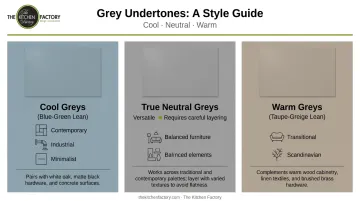
Contrasting Grey Tones: The Preferred Luxury Approach
Pairing a light grey floor with a darker grey countertop — or vice versa — creates the layered depth that distinguishes professionally designed kitchens. Think pale limestone-look tile underfoot against a charcoal soapstone counter, or a mid-grey wood plank floor anchored by a white-veined dark grey marble surface above.
That contrast works on two levels — shade (light vs. dark) and undertone:
- Cool greys lean blue or green, reading sharper in contemporary, industrial, and minimalist spaces
- Warm greys lean taupe or greige, sitting more comfortably in transitional and Scandinavian kitchens
- True neutral greys work across styles but require careful layering to avoid feeling flat
Floor and countertop greys should share compatible undertones even when they differ in shade. A cool blue-grey floor next to a warm taupe-grey counter creates an undertone clash that no amount of accessorizing will fix.
Practical tip: Always evaluate grey samples under the actual lighting conditions of the kitchen. Sherwin-Williams confirms that natural light changes perceived color throughout the day — and Los Angeles homes with strong western or southern exposure will reveal undertones very differently than a north-facing kitchen or a room evaluated under showroom lighting.
Best Cabinet Colors for a Grey Floor and Grey Countertop Kitchen
When both floor and countertop are grey, cabinets become the primary source of color, warmth, and personality. The choice carries more weight than it would in a standard kitchen where one surface provides the contrast.
White and Off-White Cabinets
Crisp white remains the most classic pairing for dual-grey kitchens — and for good reason. It delivers clean contrast, reads as timeless, and works in kitchens of almost any size. The distinction that matters:
- Stark white suits cool-toned grey surfaces and contemporary design directions
- Warm white or cream is better matched to greys with green or taupe undertones, softening the palette rather than sharpening it
The 2025 Houzz Kitchen Trends Study confirmed white as the leading cabinet color choice at 33% — a figure that reflects white's enduring appeal even as bolder options gain ground.
Warm Wood Tones
Natural wood cabinetry introduces the organic warmth that grey-on-grey inherently lacks. Medium-to-warm species — walnut, white oak, cherry — hit the right balance. Very pale woods risk disappearing into lighter grey surfaces; very dark woods can create a heaviness that compresses the space.
Architectural Digest's wood kitchen coverage includes rich walnut paired with grey paint tones and multi-grey stone countertops — combinations that feel sophisticated rather than rustic. At The Kitchen Factory's Studio City showroom, designers review wood samples directly against a client's specific grey pairing before any decision is made.
Deep, Saturated Colors: Navy, Forest Green, Charcoal
For larger luxury kitchens, deep cabinet colors create dramatic results. Grey floors and countertops act as the neutral foundation, letting deep cabinet colors make the visual impact.
Two combinations that work particularly well:
- Navy cabinets + light grey floors + dark grey countertop — bold but grounded
- Forest green cabinets + mid-grey floors + white-veined grey marble countertop — warm and layered
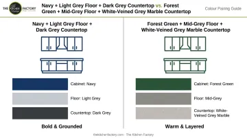
Architectural Digest's blue kitchen coverage includes kitchens where deep grey countertops and cabinetry ground the space — the same principle applies in reverse when navy becomes the cabinet color and grey handles the surface work.
The Kitchen Factory sources cabinetry from Cabinets by ZePHYR, Columbia Cabinets, and Eclipse Cabinetry — each with distinct finish ranges suited to these different design directions.
Adding Warmth to Prevent a Cold or Clinical Look
The most common mistake in grey kitchen design: prioritizing visual cohesion while underestimating how much warmth a space needs to feel livable. A kitchen that photographs beautifully can still feel uncomfortable to cook and gather in if warmth is overlooked entirely.
Natural Material Accents
Warm natural materials are the most effective counterbalance to a cold grey palette:
- Open wood shelving — floats against grey walls without adding visual weight
- Butcher block island — introduces tactile warmth at the kitchen's center of gravity
- Wood bar stools or seating — grounds the space at eye level
- Live-edge floating shelves — add organic irregularity that grey surfaces lack
As Architectural Digest notes, minimalist kitchens can feel genuinely warm through the addition of natural elements like wood and natural light — grey sets the stage; natural materials determine whether the space feels lived-in or merely designed.
Once the material choices are locked in, wall color and styling decisions determine how well those choices land together.
Wall Color and Styling Strategy
In a dual-grey kitchen, walls play a supporting role — the goal is adding warmth without competing with the floor and countertop as the visual anchors:
- Warm whites and soft creams — clean without adding a competing color
- Greige — bridges grey and beige, adding warmth without reading as beige
- Muted sage green — one of the strongest choices for warming a cool grey kitchen without introducing a jarring accent
Styling choices like woven textiles, herbs in ceramic pots, and curated cookware displays carry more visual weight in a grey kitchen than they would elsewhere. Grey's neutrality means even small seasonal changes — a terracotta bowl, a linen runner — can meaningfully shift the room's temperature and feel.
Hardware, Lighting, and Backsplash Accents That Elevate Grey Kitchens
Grey's neutrality works in your favor here: every metallic and material accent reads with maximum impact against a grey ground. The hardware, pendant lights, and backsplash aren't supporting players — they're where a grey kitchen's personality lives.
Hardware and Fixture Finishes
These metallic pairings consistently deliver the sharpest results by grey tone:
| Grey Tone | Recommended Finish |
|---|---|
| Warm undertones (taupe, green-grey) | Unlacquered brass or satin gold |
| Cool undertones (blue-grey, charcoal) | Matte black or gunmetal |
| Transitional / true neutral | Polished nickel or brushed chrome |
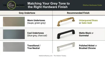
Architectural Digest's kitchen hardware guide includes unlacquered brass, satin brass, satin nickel, and matte black as the current high-end choices. Consistency across hardware, faucets, and light fixtures is what creates the visual cohesion that defines a professionally designed kitchen versus a well-intended one.
Backsplash as the Accent Surface
In a grey floor + grey countertop kitchen, the backsplash is the natural place for texture, pattern, or a material shift. Options that work particularly well in Los Angeles homes:
- Unlacquered marble slab: seamless luxury that extends the stone countertop vertically
- Zellige or handmade ceramic tile: warmth, texture, and slight variation that grey surfaces lack
- Fluted glass tile: contemporary profile that reflects light and adds dimension
- Mirrored backsplash: expands perceived space in tighter kitchens
House Beautiful's 2026 backsplash coverage highlights zellige, stone slab, and mirrored surfaces as among the strongest current choices for kitchens where the backsplash is meant to carry design weight.
Lighting Design
Grey surfaces behave differently under light depending on finish:
- Matte grey absorbs light and can darken a space if underlighting is allowed
- Polished or honed finishes reflect light, adding brightness and perceived depth
This distinction shapes how you approach the lighting plan. Layering ambient, task, and accent lighting — rather than relying on a single overhead source — compensates for how matte finishes absorb and polished finishes scatter.
WAC Lighting confirms that 2700K–3000K LEDs create a warm, intimate atmosphere — the range that prevents the cool clinical effect that grey kitchens are vulnerable to under standard white or daylight bulbs.
2026 Luxury Kitchen Trends: Where Grey Is Headed
The direction for 2026 is clear: grey is moving away from stark monochromatic statements and toward warm minimalism — a layered foundation that pairs natural stone, warm wood, and deliberate accent color rather than carrying the room alone.
House Beautiful's 2026 kitchen trend forecast points to kitchens wrapped in warm woods, honed stones, and woven finishes — a direct response to the clinical grey palette that dominated mid-2010s design. The NKBA/KBIS 2026 Kitchen Trends Report reports that statement colors are landing on backsplashes (60% of projects), wallpaper (60%), and islands (57%). Grey perimeters remain, but they're now anchoring color moments rather than enforcing uniform tone.
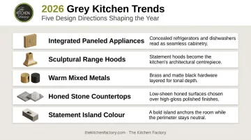
Specific 2026 directions relevant to grey-palette kitchens:
- Integrated appliances paneled in grey cabinetry for a seamless, bespoke appearance
- Decorative range hoods acting as sculptural focal points against grey-dominant spaces
- Warm mixed metals: brass with matte black, polished nickel with bronze notes
- Honed stone countertops chosen over polished finishes for a more natural, tactile surface quality
- Statement color on islands while perimeter cabinetry stays white or wood-toned
Grey remains one of the most versatile foundations in kitchen design. The shift is in how it's used: as a backdrop that amplifies texture and warmth, not as a defining aesthetic on its own.
Frequently Asked Questions
What cabinet color looks good with gray floors?
White cabinets offer timeless contrast, warm wood tones add natural warmth that grey alone can't provide, and deep colors like navy or forest green create a dramatic editorial look. The best choice depends on your countertop color and kitchen size — smaller kitchens generally benefit from lighter cabinet choices to preserve a sense of space.
What color countertop goes with grey floors?
A grey countertop creates a sophisticated tone-on-tone palette when it contrasts the floor in shade or texture. White marble and dark granite or quartz are also strong choices depending on whether you want warmth and movement or a cleaner, more contemporary result.
What cabinet color goes with gray countertops?
Match cabinet tone to your countertop's undertone: cool-toned grey countertops pair well with white or light grey cabinets, while warm-toned grey countertops work naturally with wood or greige finishes. Two-tone cabinetry — white uppers with charcoal or navy lowers — adds depth without competing with the countertop.
What is the 2026 trend for kitchens?
Warm minimalism: grey and neutral foundations layered with natural stone, warm wood, and honed surfaces. Integrated appliances, decorative range hoods, statement backsplashes, and warm metallic accents are replacing the stark black-and-white contrast that defined the previous decade.
Can you have grey floors and grey countertops in the same kitchen?
Yes — and it's a strong design choice when the two greys differ in shade, texture, or undertone. Warm cabinets, metallic hardware, and natural material accents prevent the space from reading monotonous. The key is contrast between the surfaces, not uniformity.
How do you add warmth to a kitchen with grey floors and countertops?
Warm wood elements (open shelving, bar stools, or an island), brass or satin gold hardware, and 2700–3000K lighting are the most effective moves. Zellige tile or marble backsplashes add tactile warmth, and soft textiles or live plants soften the palette.